Are you wishing for just a bit more breathing room in your kitchen? especially in older homes in Omaha, kitchens were often built on the smaller side. It’s frustrating to cook or entertain in a space that feels tight. Remodeling sounds great until you see the price tag. But what if there were a more budget-friendly way to create the illusion of space?
Believe it or not, paint color, especially on your cabinets, can make a huge difference in how big or small your kitchen feels. It’s one of the most powerful visual tricks in home design, and it can completely change how your kitchen looks and feels.
At Brush & Roll Painting, we’ve been helping Omaha homeowners with cabinet painting since 1996. We’ve worked in kitchens of all shapes and sizes, from cozy galley layouts to open-concept homes. Over the years, we’ve seen how the right paint colors and finishes can turn a cramped kitchen into a space that feels lighter, brighter, and more open.
In this article, we’re going to walk you through the best paint colors to make your kitchen feel bigger. You’ll learn how to use light, contrast, and finish to your advantage. We'll explain what to avoid and share tips that go beyond just painting, so you get the most out of your cabinet refresh. Whether you plan to do the project yourself or hire a professional, you’ll walk away with ideas you can use right away.
Best Cabinet Colors to Make Your Kitchen Look Bigger
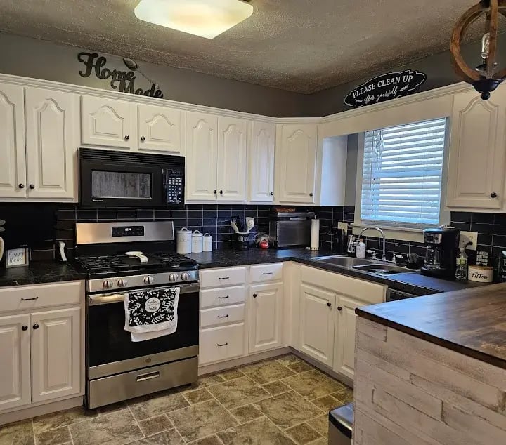
1. Choose Light Colors for an Airy Look
Light cabinet colors are the number one way to create the feeling of more space in a small kitchen. This is because light shades reflect more natural and artificial light. This reflection helps brighten the entire room, making walls feel farther apart and ceilings feel taller.
The most popular colors that help kitchens feel more spacious include:
- Soft white
- Cream or off-white
- Pale gray
- Light greige (a mix between gray and beige)
- Pastel blue or green
These colors don’t just brighten up the room, they help your cabinets feel like they’re blending into the walls rather than taking up space.
If your walls are also light, painting your cabinets the same tone or just a shade darker keeps the eye from stopping at sharp contrasts. That uninterrupted look helps make the space feel more open.
2. Use the Same Color on Cabinets and Walls
Painting your upper cabinets, lower cabinets, and even your kitchen walls in the same color can create a unified look. This avoids harsh lines and helps the entire kitchen feel seamless.
If you don’t want everything the exact same color, painting your cabinets and walls in the same color family is a smart approach. This means choosing colors that are slightly different but still closely related, like soft gray cabinets with slightly warmer gray walls, or cream cabinets with pale beige walls.
Keeping everything within the same tone helps avoid visual stops that break up the space. This creates a smooth flow between your cabinets, walls, and ceiling, which makes the room feel less busy and more spacious.
Example: If your wall color is a soft warm white like Benjamin Moore’s “White Dove,” pairing it with cabinets in a slightly deeper tone like “Swiss Coffee” or “Classic Gray” creates a subtle shift without harsh contrast.
This technique works especially well in smaller kitchens that don’t get a lot of natural light. It keeps things cohesive and soft without looking too uniform.

3. Avoid Dark or High-Contrast Colors
While navy, black, or deep green cabinets can look beautiful in large kitchens, they tend to make smaller kitchens feel even smaller. Dark colors absorb light instead of reflecting it. This makes the space feel heavier and more closed in.
Also, be cautious with high-contrast designs, like dark lowers and white uppers. While trendy, they split the kitchen into zones visually, which can make it feel chopped up. If your goal is to make the kitchen feel bigger, stick with a more uniform color scheme.
4. Use Glass-Front Cabinet Doors or Open Shelving
Here’s a design trick many Omaha homeowners love: swapping some upper cabinet doors for glass-front doors or even open shelves. When you can see into the cabinet, the wall behind it feels farther away, which helps add depth and visual space.
If you choose this route, just make sure to keep your shelves tidy. Too much clutter can undo the open feel you’re trying to create.
-3.png?width=568&height=297&name=Blog%20Post%20Image%20Size%20(9)-3.png)
5. Go With Lighter Hardware
Even your cabinet hardware plays a role in how big your kitchen feels. Large or heavy hardware can draw attention and break up the flow of the cabinets. Smaller handles in brushed nickel, soft gold, or white finishes tend to blend in better and help maintain a light, open look.
If you want to avoid drilling new holes, try to find new hardware that matches your existing spots so you can make a quick, easy update.

6. Use Under-Cabinet Lighting
Paint alone can’t fix a dim kitchen. If your space lacks natural light, adding under-cabinet lighting can make a huge difference. Light bounces off your freshly painted cabinets and countertops, making everything feel bigger and brighter.
There are affordable plug-in or battery-powered lighting options that you can install yourself in an afternoon. If you’re already having your cabinets painted, it’s a great time to upgrade the lighting, too.
7. Keep the Ceiling Light
If your cabinets go all the way to the ceiling, consider painting the ceiling the same color or a lighter version of your cabinet shade. That way, your eye travels upward without a sharp stop at a contrasting ceiling line. This makes the ceiling feel higher than it actually is.
Even if your cabinets don’t reach the ceiling, keeping the ceiling white or a very pale shade will help lift the space visually.

What About Two-Tone Painted Cabinets in Kitchens?
Two-tone kitchens can still work in smaller spaces, but you have to be selective. If you want to try this trend and still make your kitchen feel larger, use the lighter color on the upper cabinets and the darker one below. This helps ground the space without shrinking it.
Just be sure the contrast is not too stark. Soft transitions between colors are much more forgiving in small kitchens.
Tips for Making Your Kitchen Look Bigger
- Keep the countertops clear: Even the perfect cabinet color can’t fix clutter. Keep small appliances and utensils off the counters to let your new cabinet color shine.
- Use long cabinet handles: Vertical handles on upper cabinets can draw the eye upward, helping the ceiling feel taller.
- Limit visual breaks: Avoid busy backsplashes or too many finishes. Stick with one or two complementary tones throughout the kitchen.
Cabinet Painting in Omaha, NE
Now that you know how paint color can change the entire feel of a kitchen, you can approach your cabinet painting project with confidence. Whether you choose a soft white, warm beige, or light gray, the goal is to keep things simple, cohesive, and reflective.
The right color can’t literally add square footage, but it can make a small kitchen feel more comfortable and welcoming.
Brush & Roll Painting has been helping Omaha homeowners choose the right paint colors for their cabinets since 1996. While the right color is important, we know the right product and prep work process are equally important for painted cabinets that last.
Click the button below to get a quote for your next cabinet painting project.

And if you’re still deciding on a color, we’ve got a free guide that can help. Download our Paint Color & Design Guide—it includes 7 practical tips to help you pick the best cabinet colors for your kitchen. Whether you’re going for a modern look, a cozy farmhouse style, or something classic, this guide will give you ideas you can feel confident about.


-May-22-2026-01-56-32-9736-PM.png?width=800&height=418&name=Blog%20Post%20Image%20Size%20(1)-May-22-2026-01-56-32-9736-PM.png)


-May-15-2026-04-54-24-9954-PM.png?width=800&height=418&name=Blog%20Post%20Image%20Size%20(1)-May-15-2026-04-54-24-9954-PM.png)
-Sep-20-2024-01-43-26-0356-PM.png?width=800&height=418&name=Blog%20Post%20Image%20Size%20(2)-Sep-20-2024-01-43-26-0356-PM.png)


