Picking exterior paint colors can feel overwhelming. You stand in front of a wall of paint swatches at the store or scroll through endless photos online, trying to imagine how that tiny sample will look on the entire outside of your home. What makes it even trickier? Your roof. It’s not something you can easily change, but it has a big impact on how everything else looks. Maybe your shingles are a strong reddish brown, or your metal roof is charcoal gray. Either way, you may be wondering: how do I choose a house color that actually looks good with my roof?
At Brush & Roll Painting, we’ve been helping Omaha homeowners choose the right exterior colors since 1996. We’ve worked on homes with every type of roof you can think of, shingles, clay tiles, metal panels, and more. We understand how certain colors can either work with or clash against what’s already there. Our goal is to help you feel confident in your choice, not confused by it.
In this article, we’re going to walk you through how to choose exterior paint colors that work with the color of your roof. You’ll learn how undertones make a difference, which color combinations are the safest bets, and how to avoid common mistakes. By the end, you’ll know what to look for, what to avoid, and feel ready to make a choice that works for your whole home.
Why Your Roof Color Matters When Choosing House Paint
Your roof takes up a big chunk of visual space. While walls, trim, and shutters can be changed more often, your roof usually sticks around for a couple of decades. That’s why it helps to treat your roof as a permanent design element, like countertops in a kitchen remodel. It’s the anchor.
Let’s say your roof is a deep red clay tile. That automatically limits your options when choosing paint. Anything too cool, like icy blue or stark gray, will fight with that warm tone. But a cream, tan, or muted sage green? Much more balanced.
Choosing paint without looking at your roof is like choosing a tie without checking your shirt color first.

Identify the Undertones of Your Roof
The first step is figuring out whether your roof has warm, cool, or neutral tones.
Here’s a quick guide:
- Warm roofs often have hints of red, orange, or brown. Think reddish shingles, rusty metal, or tan composite.
- Cool roofs have grays, blues, or greenish hues. Think slate tiles or gray metal.
- Neutral roofs are typically mid-tone or dark charcoal, weathered wood, or black — these tend to go with more colors.
Hold a few paint samples near the edge of your roof (preferably when the sun isn’t too harsh) and see which ones feel balanced. Do they look like they belong together, or do they make each other look off?
Popular Roof Colors and What Paint Colors Work With Them
Let’s break it down by roof color and look at what works and what usually doesn’t.
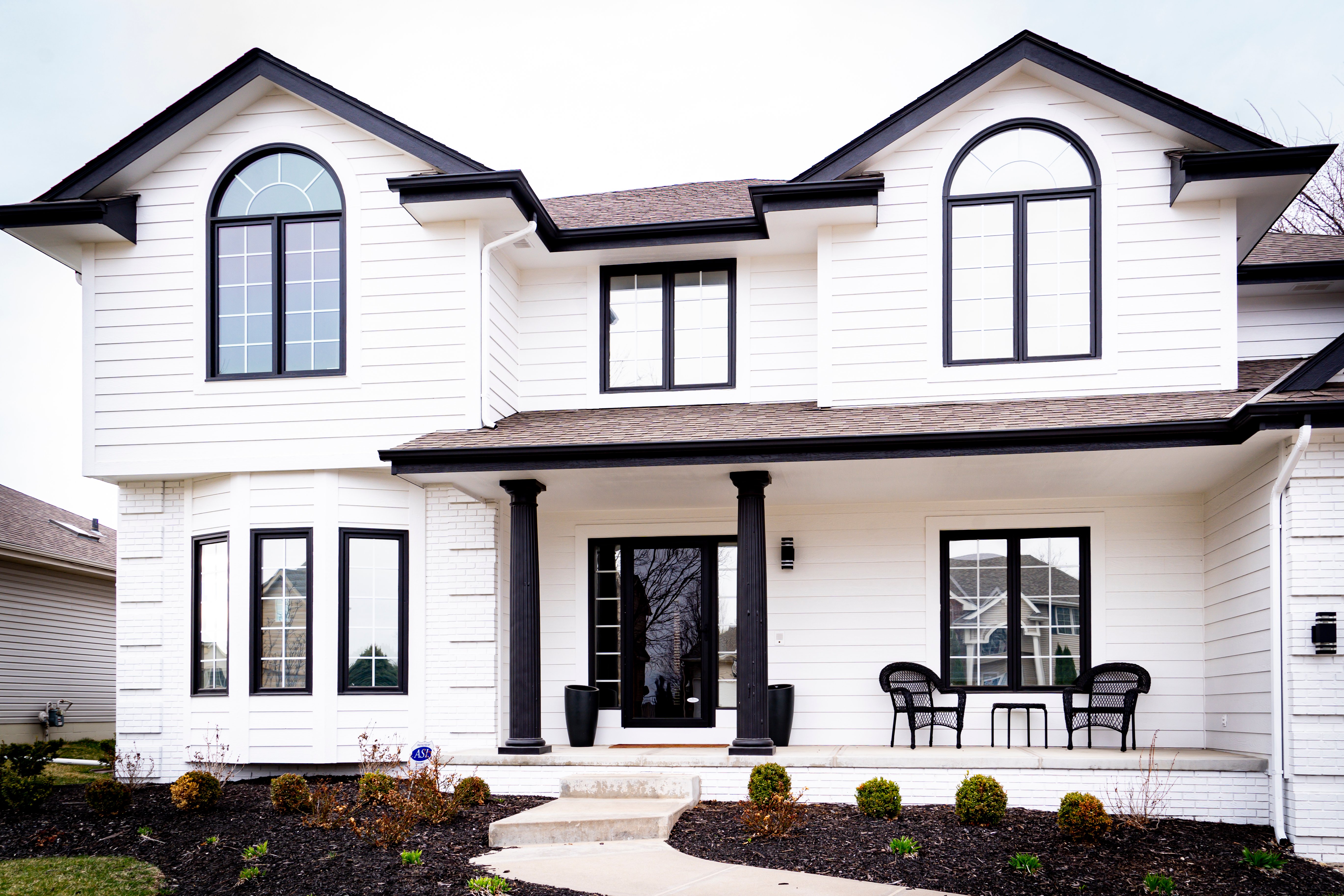
1. Black or Dark Gray Roof
This is one of the easiest roof colors to work with. It’s neutral and goes with almost anything.
Good matches:
- White or off-white
- Light gray
- Soft blues
- Sage green
- Greige
- Deep navy
- Cream
Avoid:
- Colors that are too dark, unless your home gets a lot of natural light, or it may look heavy.

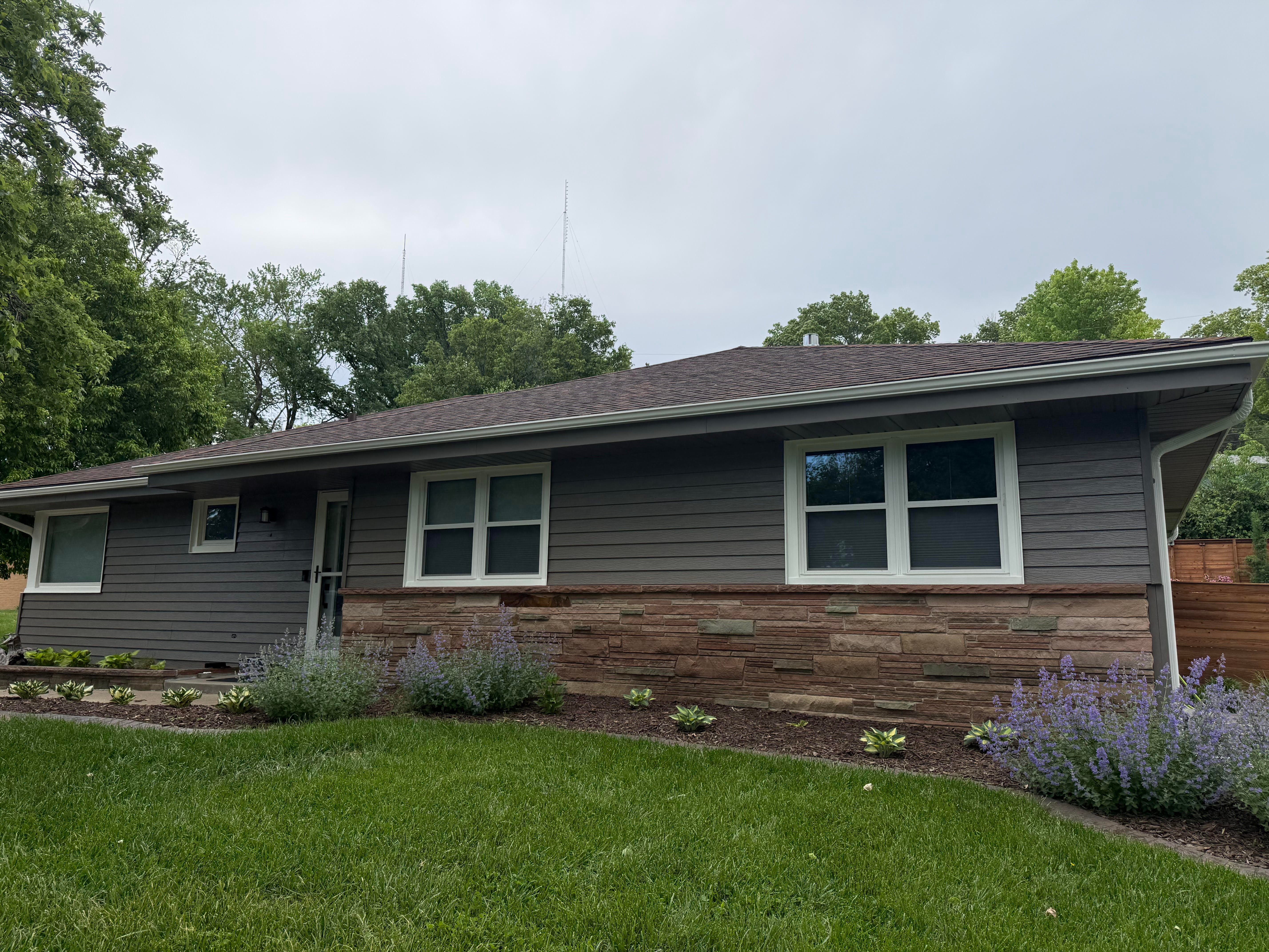
2. Brown or Weathered Wood Roof
Brown roofs lean warm, so your house colors should lean the same way.
Good matches:
- Cream or warm beige
- Taupe
- Warm gray
- Olive green
- Soft terracotta
- Muted yellow
Avoid:
- Cool grays, icy blues — these often clash with the warmth of the roof.
3. Red or Reddish-Brown Roof
Clay tile or shingles with red undertones can be beautiful, but they’re a bit more limited in what goes with them.
Good matches:
- Soft tan
- Cream
- Sage green
- Warm gray
- Earthy neutrals
Avoid:
- Bright colors or anything with blue or purple undertones.

4. Light Gray Roof
This is another versatile choice. It leans cool, so pairing it with softer tones usually works well.
Good matches:
- White
- Cool blue
- Soft green
- Pale gray
- Light taupe
Avoid:
- Yellows and pinks — they tend to look out of place with gray.
5. Green Roof
Less common in Omaha, but still seen on some homes with metal or shake roofing.
Good matches:
- Cream
- Soft tan
- Muted yellow
- Off-white
- Warm taupe
Avoid:
- Pure white or anything with a blue base.

Tips for Choosing an Exterior Paint Color
Use Trim and Accent Colors to Tie Everything Together
Even if your roof and house color feel a little distant, you can often bridge the gap with the right trim and accents.
Let’s say your roof is reddish brown and your house is going to be beige. You could choose a deep green or a soft brown for shutters and the front door. This connects the roof visually to the body of the home. Trim that is too stark white might look out of place next to a warm-toned roof — an off-white or cream might be a better fit.
Think of your trim and accents as the finishing touches that pull everything together. They don’t have to match the roof, but they should complement it.
-Mar-24-2025-02-00-17-1211-PM.png?width=609&height=318&name=Blog%20Post%20Image%20Size%20(1)-Mar-24-2025-02-00-17-1211-PM.png)
Don’t Rely on Paint Chips Alone
Paint swatches from the store are small, and they rarely give you a true idea of how the color will look in real light.
Here are better ways to test:
- Ask your painter to brush out a sample on your home (in both shade and sun).
- Use peel-and-stick paint samples, which are large and easy to move around.
- Look at real homes in Omaha with similar roofs and paint colors, and see how they work together.
The goal is to get a full picture before you commit.
Think About Your Home’s Style and the Omaha Environment
Some colors may look great online but feel out of place in your neighborhood. Omaha homes with traditional architecture — like ranches, Tudors, and Craftsman-style houses — tend to look best with classic or muted tones.
Also, keep in mind how our Nebraska weather affects color. Bright white might look sharp in the summer sun, but feel harsh in the winter snow. Deep colors may fade faster if your house gets a lot of sun exposure.
Neutral colors tend to hold up well over time, and they're less likely to feel trendy. But even within neutrals, there are warm and cool shades. Go back to the roof — that should still be your guide.
-Apr-03-2024-09-13-27-8218-PM.png?width=437&height=228&name=Blog%20Post%20Image%20Size%20(2)-Apr-03-2024-09-13-27-8218-PM.png)
Common Mistakes to Avoid When Choosing Exterior Paint Colors
- Ignoring undertones. A warm house color with a cool roof often looks mismatched.
- Using too many colors. Stick with one main color and one or two accent colors max.
- Forgetting the surrounding elements. Don’t forget to factor in your brick, stone, or landscaping.
- Choosing based only on trends. Just because sage green is popular doesn’t mean it works with a red roof.
- Skipping the test swatch. Always test your top picks on your actual home before deciding.
Exterior Painting in Omaha, NE
Choosing a house color that works with your roof doesn’t have to be stressful. The key is starting with what you already have, your roof, and working from there. When you understand undertones, see how colors play off each other, and test things in real light, you’re much more likely to land on something you love.
Brush & Roll Painting has been helping Omaha homeowners make smart, lasting choices about their exterior colors since 1996. While we’re not here to push you one way or another, we do believe a little guidance can go a long way when it comes to a big decision like this.
Click the button below to get a quote from Brush & Roll Painting.

And if you’re stuck picking a color, grab our free paint color and design guide. It’s filled with 7 helpful tips for choosing the best paint colors for your home, whether you’re going bold, keeping it classic, or somewhere in between.

Topics:


-1.png?width=800&height=418&name=Blog%20Post%20Image%20Size%20(7)-1.png)

-Sep-20-2024-01-43-26-0356-PM.png?width=800&height=418&name=Blog%20Post%20Image%20Size%20(2)-Sep-20-2024-01-43-26-0356-PM.png)


-Mar-27-2026-02-08-12-9646-PM.png?width=800&height=418&name=Blog%20Post%20Image%20Size%20(1)-Mar-27-2026-02-08-12-9646-PM.png)


