
What better way to embrace the change of a new year than by welcoming the new color of the year? Each year, color experts and trendsetters unveil a hue that captures the spirit of the times, offering a vibrant canvas for creativity and transformation.
Although these colors represent a certain year, they are typically timeless shades that always look stunning. For example, sage green (shades like Evergreen Fog by Sherwin Williams or October Mist by Benjamin Moore) was the color of the year choice for 2022, and it is still getting painted across homes on walls and cabinets consistently.
Benjamin Moore and Sherwin Williams specifically nearly went in two different directions for the 2026 color of the year. Their main chosen colors are vastly different, but their color palettes for the shades are fairly similar.
At Brush & Roll Painting in Omaha, NE, we love painting colors of the year on interior walls, cabinets, and exteriors. We know just how important the right color is. Because of this, we offer a free color consultation for any project, so you can be confident you are choosing the right color for your project.
In this article, we will discuss the color of the year from Benjamin Moore and Sherwin Williams. By reading this article, you can get some inspiration and know how to choose the best paint color for your home painting project.
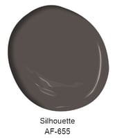
Benjamin Moore 2026 Color of the Year: Silhouette
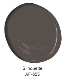
Silhouette is a deep, complex charcoal with subtle brown and deep violet undertones, creating a sophisticated backdrop that feels both modern and timeless. As Benjamin Moore’s 2026 Color of the Year, it’s designed to bring depth and intimacy to a space without feeling harsh or flat. When applied with high-quality products and careful prep, it delivers a durable, luxurious finish that holds up beautifully in everyday life, making it a smart choice for homeowners who want a color that looks rich today and remains stylish for years to come.
Where It Works Best:
This color is a statement, it's not meant to be painted on every wall and space in your home (unless that's what you want!). It's meant to be comfortable and pair well with lighter warm tones.
- Living Rooms: A focal point accent wall.
- Bedrooms: Combine it with soft neutrals for a calming space.
- Dining Room: A dark, moody dining room that stands out on the main floor.
Silhouette Color Palette
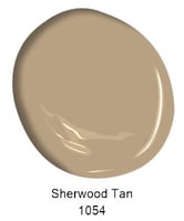
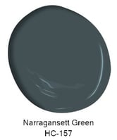
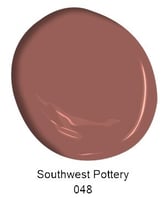
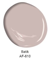

Benjamin Moore’s 2026 Color Palette of the Year leans into a grounded, livable mix of warm neutrals, softened color, and deeper statement tones that feel comfortable rather than trendy. Earth-inspired shades like Batik, Sherwood Tan, and Southwest Pottery bring warmth and a sense of age and character, while deeper anchors such as Narragansett Green and Silhouette add contrast and weight without feeling heavy.
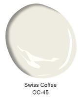
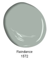
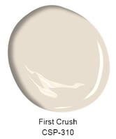
Lighter, calming hues like Swiss Coffee, First Crush, and Raindance balance the palette, offering easy options for walls, trim, and open spaces where a softer feel matters. Together, these colors work as a flexible system—easy to layer, simple to mix, and designed to create homes that feel intentional, personal, and lived-in rather than overdesigned.
This 2026 palette makes it easier to add depth and personality while still keeping spaces comfortable, familiar, and timeless.
Sherwin Williams 2026 Color of the Year: Universal Khaki

The Sherwin-Williams 2026 is Universal Khaki. Quite the opposite from Benjamin Moore. This color can be painted anywhere, its diverse. Like Silhouette from Benjamin Moore, this color pairs well with warm neutrals, making its color palette easy to adjust.
Universal Khaki is a warm, grounded neutral that brings an easy sense of balance to any room. On walls, it works beautifully in living rooms, hallways, and open-concept spaces where you want a cohesive, inviting look that flows from room to room. In kitchens, it pairs well with warm whites, creamy trim, and wood tones, creating a comfortable, lived-in feel that won’t quickly go out of style.
When applied with quality products and proper prep, Universal Khaki offers a durable, low-maintenance backdrop that hides everyday wear better than stark whites, making it a smart long-term choice for busy households.
Sherwin Williams 2026 Color Palette


Sherwin-Williams’ 2026 Color Direction centers on warmth, softness, and balance, colors that feel calm, familiar, and easy to live with year after year. Rich, grounded shades like Dark Auburn, Garden Gate, and Tarragon bring depth and confidence, offering strong options for accent walls, cabinetry, and spaces that benefit from a little weight and contrast.
These deeper tones are balanced by lighter, approachable colors such as Cream and Sugar, White Snow, and Limestone, which work well for open layouts, trim, and rooms where natural light should take the lead. Softer color moments, Watery, Henna Shade, and Lemon Chiffon, add warmth and personality without overpowering a space, making them easy to layer into both modern and traditional homes.
Together, this 2026 Sherwin-Williams palette feels practical and flexible. It’s built for mixing neutrals with color, creating contrast without sharp edges, and designing homes that feel welcoming, settled, and thoughtfully put together rather than overly styled.

How to Choose the Best Paint Color for Your Home
Choosing the right paint color can feel overwhelming, but it doesn’t have to be. The right color transforms your space, reflects your personality, and enhances your home’s overall ambiance. Here’s how to confidently pick the best paint color for your next project.
1. Consider the Purpose of the Room
Every room in your home serves a different purpose, and the paint color should reflect that. Start by asking yourself how you want to feel in the space.- Living Rooms and Bedrooms: For relaxation and comfort, opt for soft, neutral tones like light grays, beiges, or pastels.
- Kitchens and Dining Rooms: Energize these spaces with warm tones like yellows, oranges, or deep earthy colors.
- Home Offices: Encourage focus with calming greens or muted blues.

2. Work with What You Have
2. Work With Existing ElementsYour paint color should complement your furniture, flooring, and decor. Examine the fixed elements in the room, such as wood tones, countertops, or tile patterns. Use these as a base to build a cohesive color palette.
Tip: Bring samples of these materials to the paint store or take photos to compare options.
3. Think About Lighting
Lighting dramatically affects how paint looks. Natural light enhances true colors, while artificial lighting can create warm or cool undertones.
- North-Facing Rooms: These spaces receive cooler light, so consider warmer paint tones to balance it out.
- South-Facing Rooms: Bright and warm, these rooms can handle bolder or cooler colors.
4. Use Color Samples
Paint swatches are a great starting point, but seeing the color in your space is crucial. Invest in small sample pots of your top choices and paint test patches on the walls. Observe how the color looks at different times of the day before committing.
Pro Tip: Test the samples on multiple walls to see how the light and shadows impact the hue.
4. Understand Undertones
Undertones are the subtle hues beneath a color that may appear when the paint is on your walls. For example, gray paint can have blue, green, or even purple undertones. Comparing swatches side by side can help you identify these undertones before making a decision.

5. Choose the Right Sheen
Paint sheen affects how the color looks and how durable the finish is. High-sheen finishes like gloss or semi-gloss make colors more vibrant and are ideal for trim and cabinets. For walls, matte or eggshell finishes are popular for their subtle look and ease of maintenance.
6. Stay True to Your Style
While trends come and go, your home should reflect your personal taste. If you love bold colors, don’t shy away from them! However, if you’re planning to sell your home soon, neutral tones are safer for appealing to a broader audience.
7. Don’t Rush the Decision
Choosing a paint color is an important step, so give yourself time to weigh your options. Live with the samples for a few days to make an informed choice.
-Jun-21-2024-05-25-05-5483-PM.png?width=612&height=320&name=Blog%20Post%20Image%20Size%20(1)-Jun-21-2024-05-25-05-5483-PM.png)
8. Get a Color Consultation
If choosing a paint color still feels overwhelming, consider seeking help from a professional. Many interior designers or paint consultants specialize in helping homeowners select the perfect shades. They can guide you through the process, taking into account your home’s style, lighting, and furnishings.
Some painting companies even offer color consultations as part of their service. This can be a convenient way to get expert advice while planning your project. Professionals bring experience and insight, helping you avoid costly mistakes and ensuring you love the final result.
Painting Your Home in Omaha
Whether you’re looking for a shade for your next painting project or you are just interested in the 2026 color of the year, we hope you have felt some color inspiration.
When you’re ready to get one of these shades into your home, schedule an estimate with Brush & Roll Painting. Our work not only provides long-lasting color retention, but we also offer free color consultations to help you find the best shade for your space.

If you're not ready to get a quote, click the button below to download our Paint Color and Design Guide. This detailed guide is filled with expert advice and insights to help you choose the ideal colors for your project, ensuring your space mirrors your unique style and vision. Whether you're updating a single room or have a complete home renovation, our guide will offer the inspiration and assurance you need to make well-informed color decisions.


-Mar-20-2026-03-16-05-8428-PM.png?width=800&height=418&name=Blog%20Post%20Image%20Size%20(2)-Mar-20-2026-03-16-05-8428-PM.png)


