
Have you ever walked into a room and felt like something about it just felt… off? Maybe the ceiling feels too low, the walls feel like they’re closing in, or the space feels smaller than it really is. Many Omaha homeowners assume they need to remodel to fix that, but sometimes, the right paint placement can completely change how a room feels, without moving a single wall.
At Brush & Roll Painting, we’ve seen this firsthand. Since 1996, our team has helped homeowners throughout the Omaha area transform spaces through color, light, and smart paint techniques. Using high-quality products and attention to prep work, we know how color placement affects perception, from cozy basements to open-concept living rooms.
In this article, you’ll learn simple, science-backed ways to make your room look larger, taller, brighter, or more balanced with paint alone. We’ll break down the most effective color tricks, show how placement changes perspective, and answer common homeowner questions so you can choose the best approach for your space.
How Can Paint Make a Room Feel Bigger or Smaller?
Color and placement work together to create visual illusions. Light colors reflect more light, which makes a space feel open and airy. Dark colors absorb more light, which makes walls feel closer and cozier.
But it’s not just what color you use, it’s where you use it. Strategic placement of darker or lighter shades on walls, ceilings, and trim can make a big difference.
Let’s go through how painters and designers use these effects to change the feeling of a room.
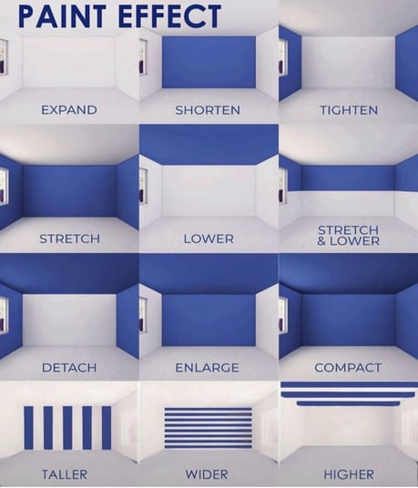
How to Make a Room Feel Larger (Expand Effect)
If your goal is to make a small room in your Omaha home feel more open, paint the back wall and ceiling a lighter color than the side walls.
This trick “pushes” the walls outward and gives the illusion of more space.
Best colors to use:
- Light neutral tones like soft beige, cream, or light gray.
- Cool undertones like pale blues or greens to create depth.
- White or off-white ceilings to bounce natural light.
Common rooms:
- Small bedrooms
- Guest bathrooms
- Laundry rooms or home offices
How to Make a Room Feel Shorter or Cozier (Shorten Effect)
If a long, narrow room feels stretched out or empty, you can make it feel more balanced by painting the farthest wall a darker color.
This creates a visual stop point, bringing that wall “forward” and reducing the feeling of excess length.
Best colors to use:
- Warm mid-tones like taupe, clay, or olive.
- Accent colors like navy or charcoal for a bold feature wall.
Common rooms:
- Hallways
- Long living or dining rooms
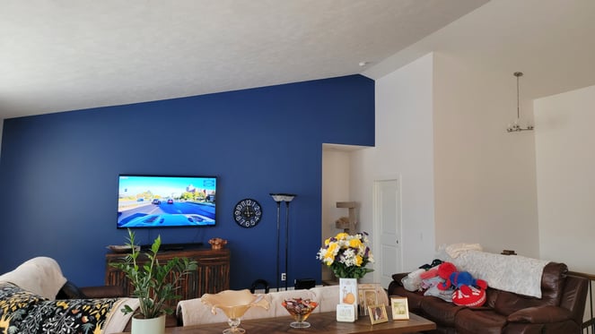
How to Make a Room Feel Narrower and More Intimate (Tighten Effect)
When you want a large, wide space to feel more cozy—like an oversized living room or basement, paint both side walls darker while keeping the ceiling and back wall lighter.
This pulls the walls inward and makes the room feel more enclosed and comfortable.
Best colors to use:
- Deep grays or moody blues
- Warm browns for a cozy, inviting atmosphere

How to Make a Room Feel Longer (Stretch Effect)
If your room feels too square or you’d like to make it feel more elongated, paint the back wall a lighter color and the side walls slightly darker.
This visually pushes the back wall farther away, creating a sense of depth.
Best colors to use:
- Lighter neutrals or whites on the far wall
- Slightly deeper tones on the side walls for contrast
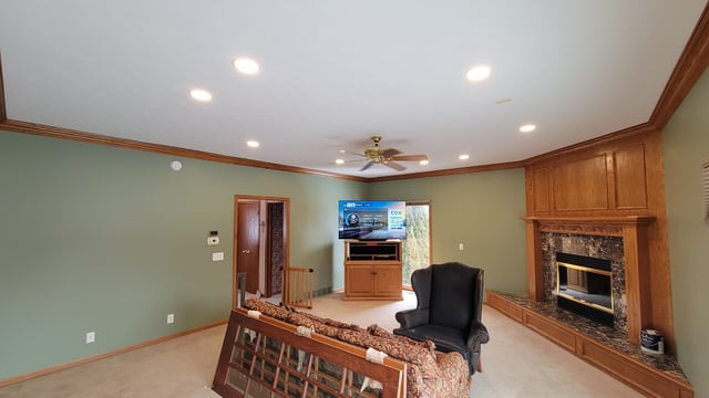
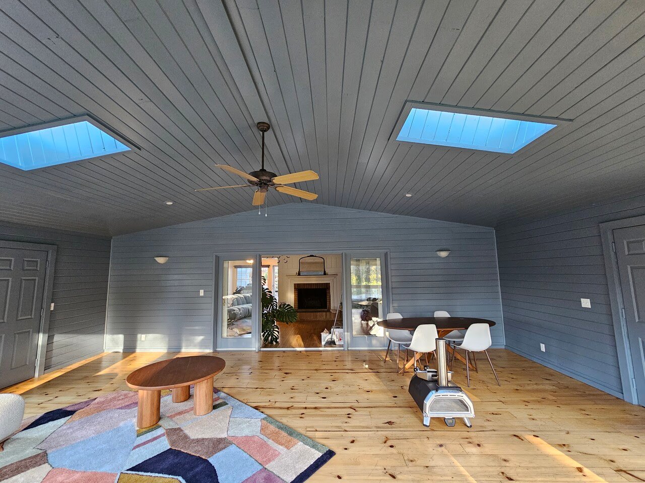
How to Make Ceilings Feel Lower (Lower Effect)
High ceilings can sometimes make a space feel cold or empty. To make the ceiling feel closer and more comfortable, paint it a darker color than the walls.
The darker tone “drops” the ceiling visually, making the space feel more grounded.
Best colors to use:
- Warm beige, soft brown, or medium gray
- Even a muted color that ties into wall tones, like dusty blue
Common rooms:
- Tall entryways
- Two-story living rooms
How to Make a Room Feel Longer and Shorter in Height (Stretch & Lower Effect)
Painting both the ceiling and back wall darker than the others can make a rectangular room feel more proportional. It visually stretches the space lengthwise but slightly lowers the perceived ceiling height.
Best colors to use:
- Darker colors like navy, espresso, or charcoal paired with light side walls
How to Make a Room Feel More Open or “Detached” (Detach Effect)
Painting just the corners or edges of the side walls darker creates separation between surfaces, making the space feel visually detached or broken apart.
This technique can help define different zones in open-concept layouts without adding walls.
Best colors to use:
- Mid-tone neutrals like stone gray or greige for subtle division
- Accent shades to highlight architectural features
.jpg?width=615&height=346&name=Havens%20after%204%20(1).jpg)
How to Make a Room Feel Bigger and More Airy (Enlarge Effect)
When you paint all four walls the same light color and keep the trim and ceiling bright white, everything feels cohesive and open.
The lack of contrast makes boundaries disappear, helping a small space feel much larger.
Best colors to use:
- White, off-white, or soft neutral tones
- Benjamin Moore White Dove, Swiss Coffee, or Pale Oak (favorites in Omaha homes)
How to Make a Room Feel Smaller or More Compact (Compact Effect)
Painting every wall, including the ceiling, a darker color wraps the space in warmth.
This technique makes a room feel intimate and enclosed, perfect for areas where you want comfort or coziness.
Best colors to use:
- Deep navy, charcoal, or forest green
- Warm browns and reds for dens or theater rooms
How to Make Walls Look Taller (Taller Effect)
Vertical stripes draw the eye upward, creating the illusion of height.
This works beautifully in rooms with low ceilings or older Omaha homes where ceiling height can feel limiting.
Tips for success:
- Use painter’s tape for even stripes.
- Choose subtle tone differences, such as off-white and beige.
- Avoid too many stripes in small rooms—they can feel busy.
How to Make Walls Look Wider (Wider Effect)
Horizontal stripes, or color blocking with bands of color that run across the wall, make a room appear broader.
This can help narrow rooms or hallways to feel more balanced.
Best colors to use:
- Soft blues, grays, or greens paired with white trim
- Lighter stripes for subtle expansion, darker stripes for bold style
How to Make Ceilings Feel Higher (Higher Effect)
If your ceiling feels low, paint it lighter than the walls.
You can even bring the wall color slightly onto the ceiling edge to blur the line between them.
This makes the ceiling appear to lift upward visually.
Best colors to use:
- Crisp white or very pale tones
- Matte or flat finishes to reduce shadowing
Bonus tip:
Use vertical accents like tall curtains or bookcases to enhance the illusion.
How Does Lighting Affect These Paint Tricks?
Light is everything when it comes to paint perception. A color that feels bright and spacious in natural daylight might look darker under warm artificial lighting.
In Omaha, where winter months bring much shorter daylight hours, natural and artificial light should be part of your color decision.
General guidelines:
- Natural light: Cooler tones (blue, gray, green) balance bright sunlight.
- Warm artificial light: Warmer tones (beige, greige, cream) help balance the yellow cast.
- Low-light rooms: Stick with lighter neutrals to prevent feeling closed in.
What Colors Work Best for Omaha Homes?
Because Omaha experiences all four seasons, homeowners often prefer versatile colors that feel cozy in winter but fresh in summer.
Popular local favorites:
- White Dove and Swiss Coffee for timeless warmth
- Edgecomb Gray and Pale Oak for light neutrals
- Hale Navy and Kendall Charcoal for dramatic accents
- Salisbury Green and Revere Pewter for earthy, balanced tones
These shades pair beautifully with natural light and seasonal decor, helping homeowners enjoy their space year-round.
FAQs About Paint and Visual Effects
Q: Can paint really change how big my room looks?
Yes. Light and placement play with your perception of space. The eye follows light, so brighter areas feel larger, and darker ones feel closer.
Q: Should I use flat or satin paint for these paint effects?
Flat or matte finishes hide imperfections and create softer visual edges, which help space-expanding tricks. Satin or semi-gloss paints reflect more light and can highlight shape changes.
Q: Do darker colors always make a room feel smaller?
Not always. When used strategically, like on one wall or the ceiling, dark colors can add depth and drama without shrinking the room.
Q: How can I test these ideas before committing?
Paint large sample sections or use peel-and-stick samples to see how colors change throughout the day.
Interior Painting Wall Color Tricks
The right paint colors can completely change the way your home feels. Whether you want to make a small Omaha bedroom feel bigger, raise a low ceiling, or cozy up a large living room, thoughtful color placement can help.
At Brush & Roll Painting in Omaha, NE, we’ve seen how a few shades of color can bring comfort, balance, and personality into a space. Since 1996, our team has helped Omaha homeowners use paint not just for style, but for feeling.
If you’re planning your next painting project, click the button below to get a quote, and we’ll help guide you through your options.

You can also download our free Color and Design Guide to get real tips on choosing the best colors for your next interior wall painting project.


-May-22-2026-01-56-32-9736-PM.png?width=800&height=418&name=Blog%20Post%20Image%20Size%20(1)-May-22-2026-01-56-32-9736-PM.png)


-May-15-2026-04-54-24-9954-PM.png?width=800&height=418&name=Blog%20Post%20Image%20Size%20(1)-May-15-2026-04-54-24-9954-PM.png)
-Sep-20-2024-01-43-26-0356-PM.png?width=800&height=418&name=Blog%20Post%20Image%20Size%20(2)-Sep-20-2024-01-43-26-0356-PM.png)


